views
New Delhi: At this point, there are still some people on Facebook who do not have Timeline, even though the social network made it mandatory. In spite of this, Facebook is testing a new layout for Timeline with some subtle changes to guarantee a round of anger from users and then acceptance.
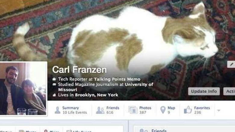
Carl Franzen at TPM has been one of the few users to have the new Timeline already (they're currently in beta testing). It looks like your basic information, which previously rested under your profile picture and cover image, will now move as overlay text into your cover image.
This is likely to anger fans who want their cover images to not have any other element cluttering the picture. So now, your name, the school or college you went to, where you work, your birthday and your relationship status will appear as white text over your cover image.
The company has also made minor changes to the way the number of friends you have, your photos and your likes will appear. Initially, the old Timeline had these show up underneath your cover image with large thumbnails of the element. So for instance, for your friends' list, you would see a thumbnail with a collage of six of your friends' profile pictures. With photos of you, a thumbnail would appear reflecting the last photo you were tagged in.
Now, while these elements will still appear under the cover image, they will be closer to the profile picture and more elements will be added. These will now also be only text based elements. Facebook has added a "Summary" element, which when clicked, shows you a summary of your life events. Likes has now turned into "Favorites". Facebook hasn't specified how many users have this new format of Timeline at the moment or when it will roll out to everyone.
To read more visit: tech2.com






Comments
0 comment