
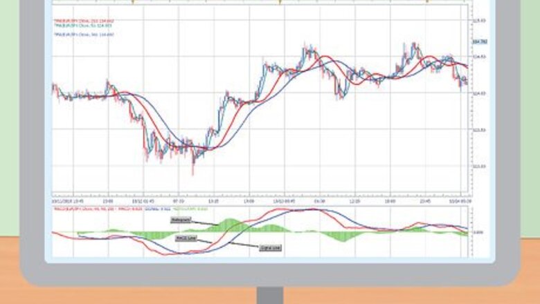
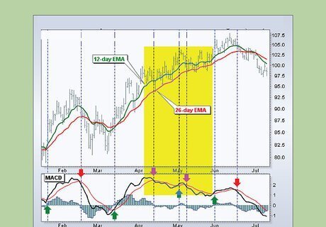
Understanding the MACD Interface
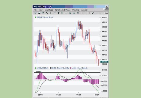
Understand the basic setup. Most MACD interfaces are set up as two separate graph boxes. The upper box contains a candlestick chart for the security in question. This chart tracks the trading price of a security over time by representing each day as a "candlestick" that shows the day's opening, closing, high, and low prices. Below that is the MACD graph that shows several lines and the MACD histogram. These trend lines are the MACD line and the signal line. Overlaid on top of these lines is the MACD histogram.

Learn how each part of the interface is calculated. Each part of the MACD interface is the result of price calculations. Understanding MACD analysis requires understanding exactly how each part is calculated. The candlestick chart is fairly simple to understand: The box represents the opening and closing prices of the security, while the line out to either side (if any) represent the high and low prices. The MACD line is the difference between the 12-day and 26-day exponential moving averages (EMA) of the security's price. The EMA is like a regular moving average, except more weight is given to newer data. The signal line is the 9-day EMA of the MACD line itself. The MACD histogram is a series of bars that shows the difference between the MACD and the signal line.
Understand the signal line. The signal line is so named because it serves as an indicator for timing trades. That is, when the signal line crosses the MACD, you should either buy or sell the security, depending on your position and the direction of the movement. Essentially, it tracks the momentum of the MACD itself, and can show when changes in momentum are able to occur. This then relates to the price, allowing traders to (hopefully) time out price swings. Specifically, when the signal line crosses MACD and goes below, this is a "bearish" signal and it may be a good time to sell. The opposite is true for when the signal line goes above MACD (a "bullish" signal).

Know how the MACD histogram is read. The MACD histogram is calculated as the difference between the MACD and signal line values for a given day. It's value is positive (above the zero line) when MACD is greater than the signal line and negative (below the zero line) when MACD is less than the signal line. It is zero when the two lines intersect.
Interpreting Shifts
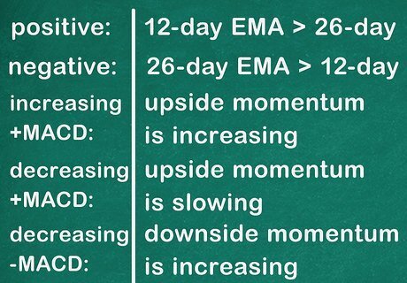
Interpret moves in the MACD line. MACD is a measure of changes in momentum between shorter-term and longer-term price averages. The sign (positive or negative) and magnitude or the MACD line represents the interplay between the two underlying EMAs. This manifests in the following ways: If MACD is positive, the 12-day EMA is greater than the 26-day. If MACD is negative, the 26-day EMA is greater than the 12-day. An increasing positive MACD means that upside momentum is increasing. A decreasing positive MACD means that upside momentum is slowing. A decreasing negative (becoming more negative) MACD means that downside momentum is increasing. An increasing negative (becoming less negative) MACD means that downside momentum is slowing.
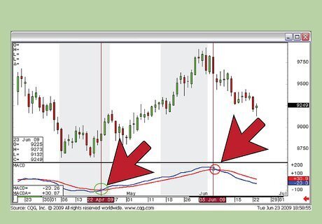
Analyze crossover signals. As previously mentioned, a signal is observed when the MACD crosses the signal line. A bearish signal occurs when the MACD is below the signal line after the cross, where a bullish signal occurs when the opposite happens. However, these signals are not always so clear. For example, a cross at an extreme MACD value (based on historical highs and lows) can mean a false signal. This would represent a drastic movement in the price of the underlying security. Signal crossovers may occur more frequently or less frequently, depending on the volatility of the underlying security.
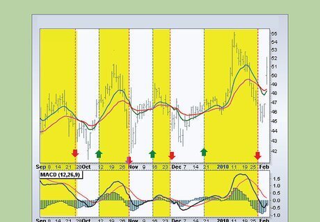
Read centerline crossovers. This type of crossover occurs when the MACD line moves about the zero line. Traders watch for this change to determine simple changes in momentum. There is upside momentum when MACD is positive and downside momentum when it is negative.
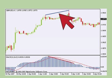
Look out for divergences. Divergences occur when the differences between extremes in the price of the underlying security and the MACD are different. For example, imagine that between two low prices on the graph of the security's price, the security experienced a lower low the second time (a lower low). At the same time the MACD experienced two corresponding low points, but the second low point was higher than the first (a higher low). This "divergence" shows that there is a downtrend in the price of the security, but that the downside momentum is decreasing. This is a bullish divergence, as the MACD is a higher low. This may mean that the security's downtrend is coming to an end. A bearish divergence is the opposite situation. For example, the price graph might have a higher high than the MACD chart.
Using MACD to Trade
Use MACD to estimate the strength of price swings. MACD is primarily used to identify the direction and magnitude of short-term momentum in price movements. In other words, it tracks the speed of price changes. In practice it is used more to estimate magnitude than direction. Track this magnitude by using the MACD histogram. The height of the bars represents the strength of the price movement. Slowing upside momentum may mean that a trader should prepare to sell. Slowing downside momentum may mean that a trader should prepare to buy.

Make trades at signal crossovers. At signal crossovers, the trader should prepare to buy or sell the security. At a bullish signal crossover, the trader should consider buying. At a bearish crossover, the trader should consider selling. However, this depends on the nature of the crossover. A crossover at the extreme of the MACD should be treated with skepticism.

Supplement the MACD charting resource with other visual tools. Although a MACD crossover, convergence or divergence can be useful, other resources can shed more light on bullish or bearish signals relevant to a specific time line. The candlestick chart shows highs and lows for each day of trading in a visual sequence. The chart also shows whether prices trended up or down during a particular trading day. This allows traders to look at "flickering" patterns related to the action of price changes, represented in candlestick charting as "wicks," and make more informed decisions on buying and selling. Many experts consider candlestick charting to be both an important complement to MACD, and more effective than MACD on its own.
Creating MACD in Excel
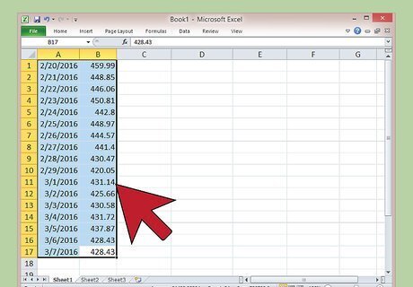
Input historical closing prices. If you don't have access to a pre-created MACD display through trading software, you can create your own using Microsoft Excel. Your starting point should be to locate closing prices for the stock in question. You can get this data from a major financial news site, like Yahoo! Finance or MarketWatch. Many of these sites will also give you the option to download the data as a spreadsheet, so it is pre-formatted for your use. A good starting point is to collect data for three month's worth of trading. This includes closing prices for each day of market activity. Your data should be formatted with the date in column A and closing price data in column B.
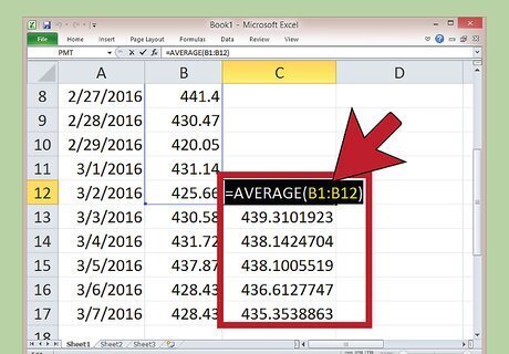
Calculate the 12-day EMA. The 12-day EMA is the more responsive part of the MACD. This is calculated first as a simple average of the first twelve closing prices, but thereafter as a function of the present day's closing price and the EMA. To get started, start in column C next to the twelfth closing price in your list. From there, type in "=AVERAGE(" and then the range of data points in column B, followed by a closing parenthesis. For example, if your data points started in cell B1, you would use the range B1 to B12, expressed as B1:B12. This would give you a completed function of "=AVERAGE(B1:12)". Your function would then be placed in cell C12. Then, one cell below that function (C13 in the example), enter the following: "=[B cell to the left of this one]*(2/13)+[C cell above this one]*(1-(2/13))". So, the example would have, in cell C13, the following: "=B13*(2/13)+C12*(1-(2/13))". Click on this function and drag it down to the bottom of your data to fill in the rest of the 12 day EMAs.
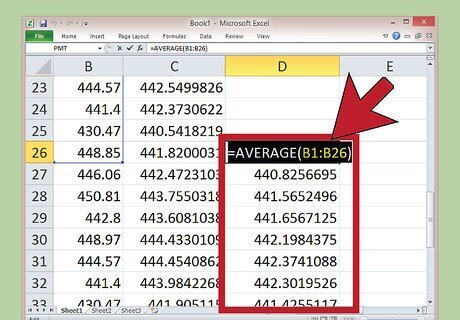
Fill in the 26-day EMA. This process is identical to entering the 12-day EMA, except for the fact that the equation is slightly different and that you start on the 26th closing price. In column D, next to the 26th closing price (and it's corresponding 12-day EMA in column C), enter the following: ="AVERAGE(" and then the relevant data points, followed by a closing parenthesis. So, in the example, this would be "=AVERAGE(B1:26)" in cell D26. In the next cell down, D27 in the example, type in the following: =[B cell to the left of this one]*(2/27)+[D cell above this one]*(1-(2/27))". For the example, this would be: =B27*(2/27)+D26*(1-(2/27)). Click and drag this formula down to fill in the rest of your data.
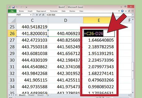
Find MACD. The MACD will be shown in column E. It is calculated by simply subtracting the 26-day EMA from the 12-day EMA. Next to the first 26-day EMA, cell E26 in the example, type in: "=C26-D26". The result in the MACD for that day. After that, click on this cell and drag it down to the bottom of the sheet to get the rest of the MACD measurements.
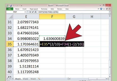
Calculate the signal line. The signal line is just a 9-day EMA of the MACD, and is produced similarly to the two previous EMA data points. Start in column F next to the ninth MACD value (cell F34 in the example). Then, type in: "=AVERAGE(E26:E34)". You can adjust the range if your first nine EMA values are in different cells. Then, one cell below that (F35), type in "=E35*(2/10)+F34(1-(2/10))". Again, adjust the referenced cells if your data are in different ones. Click on the formula and drag it to the end of your data points to fill in the last of your data.
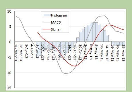
Chart your data. With your completed MACD and signal line data, you can create a MACD display. Use Excel's graph tools to show your MACD and signal lines as line graph over certain time periods. You can also graph the 12 and 26-day EMAs or the price for more data to compare.


Comments
0 comment