views
Start with a title slide.
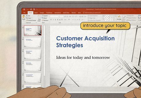
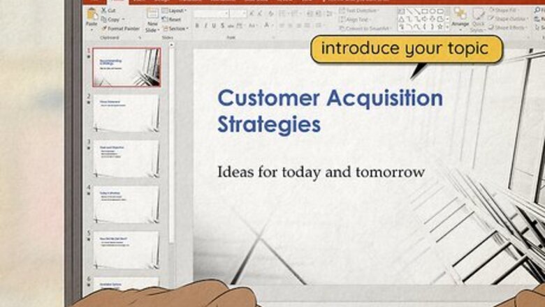
Introduce your topic with an eye-catching first slide. Put the name of your presentation in large letters in the middle of the slide so it’s easy to read from across the room. Depending on the type of presentation, you can also include your name and title on the slide if your audience doesn’t know you. Keep the background simple on the title slide so it doesn’t distract your audience while you’re speaking. You can always name the presentation after the work initiative you want to start or the problem that you’re trying to solve. For example, you could name it something like, “Customer Acquisition Strategies.”
Follow the title slide with an agenda slide.
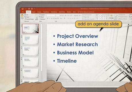
Give a list of what the audience can expect. Label your slide with the title “Presentation Agenda” or something similar. List the main points that you’re hoping your audience learns from the presentation. Not only does this help your audience follow along better, but it also gives them an idea of your overall goal. For example, if you’re discussing a new work initiative, your agenda slide could read: Project Overview Market Research Business Model Timeline
Organize the middle slides for logical flow.

Determine the presentation’s beginning, middle, and end for more clarity. Write down the main ideas that you want your audience to take away from your presentation and the information you’d like to include. Take what you’ve written down and organize the points into an outline so one point flows directly into the next one. Try a few different arrangements for your information so you can figure out which one is the easiest to follow. For example, if you’re giving a persuasive presentation, you might start with background information on an issue, move on to ways to solve the problem, and finish with steps a person in the audience can take to work toward the solution.
Include a call-to-action slide near the end of your presentation.
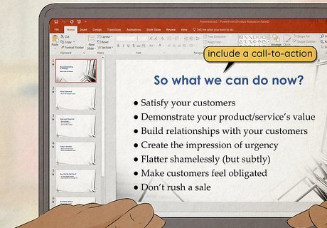
Tell your audience about the next steps to take when you wrap up. Once you go over the main ideas you’re presenting, offer up a bulleted list of steps that your listeners can take to help move the project forward. Try to think of some things that are actionable so your audience has a few different ideas of what they can do next. For example, if you want to cut down costs at your business, you may ask your listeners to track all of the work resources they waste throughout a week so they can be more conscious of what they’re throwing away.
Conclude with the key takeaways.

Summarize the main points you made so your audience remembers them. As your last slide, start with a header on top with something like “Takeaways” or “Key Points.” Write one final bulleted list with the most important information you covered. Highlight the points that you’ve stated on previous slides and repeat them out loud for your listeners. That way, your audience will have a lasting impression from your presentation, and they’re more likely to remember what you’ve said. For example, if you’re pitching a brand or product, you could summarize the issues the product solves, its main selling points, and why you think it's a good fit in a company.
Aim to have about 10 slides.
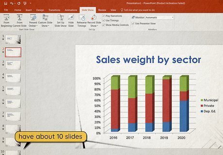
It’s tough for people to remember more than 10 concepts at a time. When you’re finished organizing all of your information, go back and count your slides to see if you have 10 or fewer. If you have more than 10, read through the information again and see if there’s anything you can combine into the same slide. Determine what concepts are the most important to address, and cut out anything that seems out of place or doesn’t fit the tone of your presentation. For example, if your presentation is about a new eco-friendly initiative, a few slides filled with statistics about climate change’s effects offers a lot of information, but a single slide with a couple of bullet points specifically about how your company is hurt by it is much more effective.
Use consistent backgrounds.
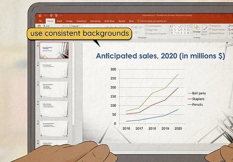
Maintain the same simple layout and theme for all of your slides. You can either design the background in PowerPoint on your own, or you can use one of the free templates built into the program. Stick with simple designs that don’t distract from the information or images you want to include. When you add information into the presentation, keep it aligned to the same side on each of your slides so it’s easier to read and follow along. For example, your slide background could simply be white with a dark blue stripe across the top and a yellow line running through it as an accent. Stick with colors that contrast, but complement each other. For example, you could incorporate white, dark brown, black, and tan as a presentation theme. Avoid putting full images as your background since it can be really hard to read text that’s written over them.
Choose easy-to-read fonts.

Stick with large sans-serif fonts so they’re easy to see across the room. Small fonts can be really hard to read from a distance, so keep your text between 28–40 pt. Since sans-serif is easier to see on a screen, choose something like Proxima Nova or Arial to present your information rather than Times New Roman or another serifed font. Make sure to make the text a color that pops out from the background so it doesn’t get lost. Emphasize the most significant text by bolding, italicizing, or highlighting it. Vary your text size throughout the slide. For example, the heading at the top of the slide should be larger than the body text.
List main ideas with short bullet points.
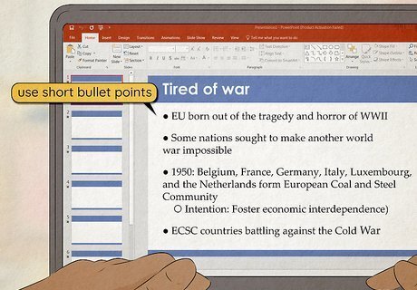
Quick lists on your slides make it easier to follow along. Paragraphs are really intimidating on a slide and your audience may read them instead of listening to you. Don’t put every word you’re going to say on your slide, but instead stick to a bulleted list with short phrases or keywords. Limit yourself to a maximum of 6 bullet points per slide with a maximum of 6 words per bullet point. For example, instead of the sentence, “We need to be more mindful about our budget for this project,” you could write the bullet point, “Be mindful of budget.” Have each bullet point appear only after you click the mouse so your audience doesn’t get ahead of what you’re talking about.
Add relevant graphics.
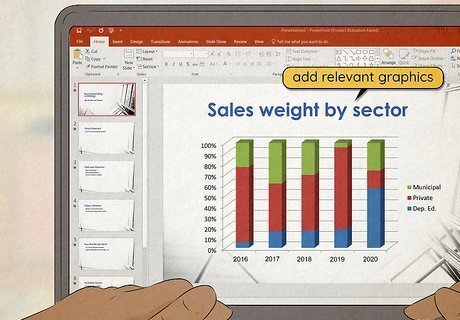
Choose high-quality images and charts that highlight your information. Only include visuals if they’re necessary for the point you’re trying to make. You can use illustrations, pictures, graphs, or charts to make your point clearer or present information. Make all of the images a similar size and resolution, and place them in the same location across your slides so they don’t look cluttered. Include captions for charts or images that are hard to understand. Try making a single image stand out on a slide by making it a contrasting color to the rest of the slide. For example, you could have pictures of old products in black-and-white with a large image of the newest product you’re introducing in color. In general, avoid using clip art or animated GIFs in your presentation since it won’t look like you’re taking it seriously. However, what’s acceptable may depend on your place of work and the specific presentation. If you get a chance, check your presentation on a screen similar to what you’ll be presenting on to check if your images look blurry from across the room.
Avoid flashy transitions.
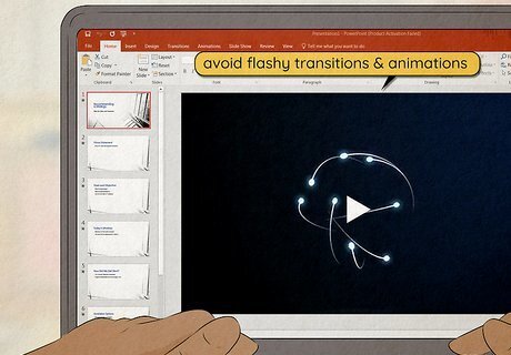
Transitions and animations distract a viewer from the content. While animations may seem cool to make your slideshow pop, they can take up a lot of extra time and detract from what you’re trying to say. Instead of having text fly in or animating between slides, just have the slides change as soon as you click the mouse. Present the information quickly and without a lot of flourishes to help your presentation look stronger and more official.
Practice your presentation out loud.

Run through the entire slideshow to boost your confidence. You’ll feel a lot more confident giving your presentation once you run through it a few times on your own. Pretend that you’re actually presenting to a group of people and raise your voice to the same volume and tone you’d use for the real thing. As you’re speaking, practice clicking through the slides to make sure they flow well together. If you run into any problems or feel like your presentation is confusing, go back and edit your slides to fix them. Try recording yourself giving the presentation so you can listen or watch your performance. That way, you can easily see what you need to change.
Rehearse in front of an audience.

Ask for some preliminary feedback to see if your presentation lands. Gather a few friends or work colleagues and run them through the entire presentation. After you finish, find out what they thought of the presentation and if they were confused by any of the points you were trying to make. Have them ask questions you expect from your audience as well so you can practice answering them concisely. If you can, rehearse your slideshow in a space that’s similar to where you’ll actually be presenting it so you can get a feel for the room.





Comments
0 comment