views
Scaling Dates and Text on the X Axis

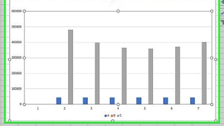
Click anywhere in the chart. For most charts, the X axis is used for categories/text labels (including dates). Start by clicking the center of your chart to display the Chart Design and Format menus at the top of Excel. If you're using Excel on a Mac, you'll need to click the View menu and switch to Print Layout first. If your X axis contains numbers that aren't dates (or you're using an X Y scatter or bar chart), the steps are a little different. You'll also have more scaling options!

Click the Format menu. It's at the top of Excel.

Select Horizontal (Category) Axis from the drop-down menu. You'll see this menu at the top-left corner of Excel.

Click Format Selection or Format Pane. You'll see one of these two options below the drop-down menu at the top-left corner.
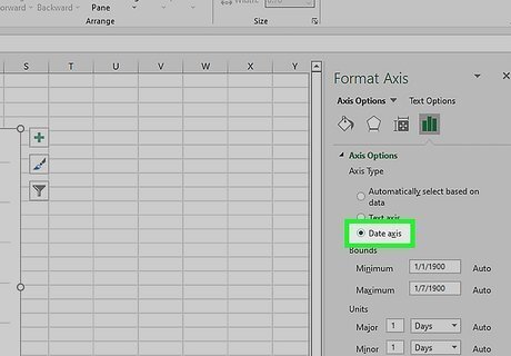
Choose whether your axis is text or a date. Select Text axis if the values on your X axis are anything other than dates. If you have dates on this axis, choose Date axis.

Set the date range in the "Bounds" fields (dates only). Enter the date where the X axis should begin into the "Minimum" field, and the final date into the "Maximum" field.
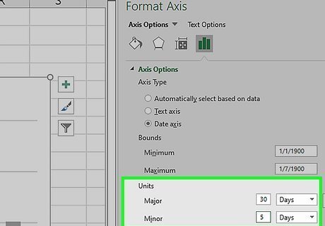
Specify the interval (dates only). In the "Units" section, you can control the interval by typing a number from the "Major" menu and choosing a duration, such as Days, Months, or Years. You'll see larger tick marks at the "Major" interval and smaller ticks at the "Minor" interval. For example, if you want to show a larger tick mark every 30 days and a smaller one every 5 days, you'd type a "30" into the "Major" field, a "5" into the "Minor" field, and chose Days for each.

Set where the vertical axis (Y) crosses the horizontal axis. If you're working with dates, you can set the Y axis to cross between dates, at a particular date, or at the maximum (last) date. If you're working with text categories, you can set the Y axis to cross at a particular category number, at the maximum (last) category, or just leave "Automatic" selected and adjust as necessary.
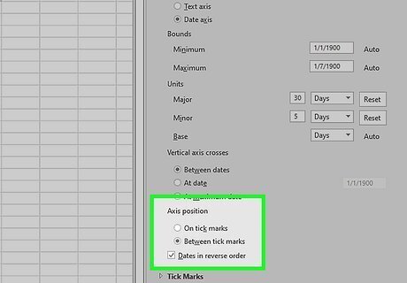
Choose whether to show dates or text labels in reverse order. If you want to switch the order of the values on the X axis, check the box next to "Dates/Categories in reverse order" below the "Axis position" section.
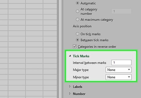
Change your tick mark settings. Expand the "Tick Marks" section and customize: Dates: You can adjust the position of both the major and minor tick marks, or opt to leave either type out. Text: Enter a value into "Interval between marks" to customize the intervals between tick marks, then use the "Major" and "Minor" menus to adjust the positioning of the larger and smaller tick marks.
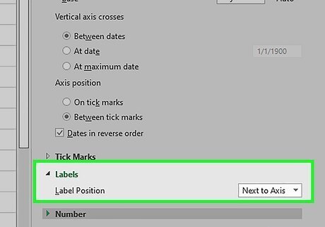
Customize the label settings. Expand the "Labels" menu to find options for the labels on the X axis. Dates: You can customize the placement of the dates using the "Label Position" menu. Text: You can specify the interval between labels by choosing Specify interval unit and entering a number. You can also customize the distance between the label and the axis, as well as the label's position.
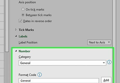
Format the numbers. The chart automatically inherits the number format you used in your data. If it doesn't look right, use the options in the "Number" section at the bottom to choose a different number format. You can also use the icons at the top of the "Format axis" panel to customize other details of the X axis, such as the alignment and fill.
Scaling Numbers on the X Axis

Make sure you're using a chart type that supports horizontal (X) scaling. If you want to adjust the scale of a range of numbers along the X axis, you'll need a chart meant for showing and comparing numeric values. X Y scatter and bar charts are the two chart types that let you scale any numbers on the X axis. Other chart types reserve the X axis for categories rather than values. X Y scatter charts are usually going to be what you need, especially if you have many numerical data points on the X axis and want to scale them nicely. To change your chart type, right-click the middle of the current chart and choose Change Chart Type. Then, select X Y (Scatter) or Bar in the left panel and choose an option. Both chart types have several styles you can choose from—just use the icons at the top of the window to see all of the options.

Click anywhere in the chart. This displays the Chart Design and Format menus at the top of Excel. If you're using Excel on a Mac, you'll need to click the View menu and switch to Print Layout first.

Click the Format menu. It's at the top of Excel.

Click Format Selection or Format Pane. You'll see one of these two options below the drop-down menu at the top-left corner. Horizontal (Value) Axis only appears on XY scatter and bar charts. If you're using another chart type, you'll see Horizontal (Category) Axis instead. You can't scale category axis like you can a value axis.
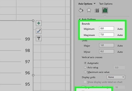
Change the range in the "Bounds" fields. Enter the number where the X axis should begin into the "Minimum" field, and the final number in the scale in the "Maximum" field. If you want to reverse the order, just scroll down and check the box next to "Values in reverse order." If you check the box next to "Logarithmic scale," each value on the X axis will be multiplied by the value you enter into the "Base" field.
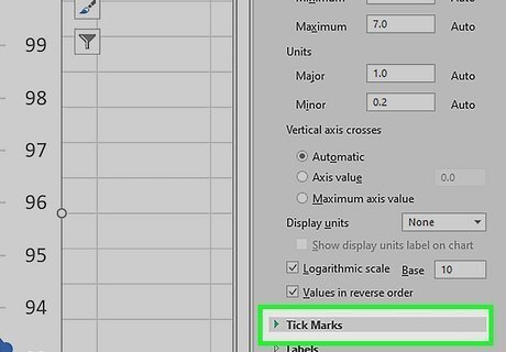
Specify the tick mark interval. You'll set the intervals between tick marks by entering values into the "Major" and "Minor" fields. For example, if you want to show a larger tick mark every 100 sales and a smaller one every 50 sales, you'd type a "100" into the "Major" field, and a "50" into the "Minor" field. To change the orientation of the tick marks, use the options in the "Tick Marks" section a little bit below.

Format the numbers. The chart should automatically inherit the number format you used in your data. If it doesn't look right, use the options in the "Number" section at the bottom to choose a different number format. You can also use the icons at the top of the "Format axis" panel to customize other details of the X axis, such as the alignment and fill.


Comments
0 comment