views
Dark mode is taking over the entire world. The introduction of the dark theme on WhatsApp was a much celebrated addition, while dark mode enhancements to Facebook, Twitter, the entire Android menus and the likes have all been noticed, scrutinised and largely appreciated. However, despite so many system level changes to add a dark theme to almost all apps, Google has conspicuously stayed away from adding a dark theme to Google Search. Now, courtesy of a neat little trick from 9to5Google, you can get a glimpse of how life with the darker side of the search engine can look like.
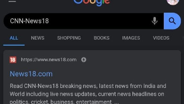
To get a glimpse of how dark mode works on Google Search, start by raising a query on Google from within Chrome for Android. Once you’ve searched for your desired query, tap on the URL bar, and edit the URL by going to the end of the address and adding: &cs=1. Once you hit enter, the page you searched for will simply reload in all the glory of a wonderful looking dark-themed search page. Unfortunately, the feature is available only on Google Chrome browser on Android, and users of other browsers cannot view the Search dark mode at all.
However, the implementation of the dark mode on Google Search appears half-hearted at best, at least for now. By adding the Chrome framework via the URL, as well as the flag (in Chrome’s developer cycle apps) to turn entire pages into dark themes, Google has offered scope for the feature to be added some time in future. Alternatively, for developers working on their apps and customisations, the framework will allow them to test their products, and see how well the dark theme applies in non-native dark theme pages.
As of now, however, there appear to be some lack of conviction. While Google has added the framework, in our tryst with the system, the profile image that appears at the corner turned into inverted colour. This appears to be a bug since the rest of the colours of the page are in line with how they should be. Still, the contrast between different shades is so high that it does not look like a finished product, at least for now. Given the present situation, it is not yet clear as to when we may expect dark mode as a feature on Google Search, if at all.


Comments
0 comment