
views
Designing a Pamphlet

Determine the purpose and target audience of your pamphlet first. Knowing the demographic who will most likely read your pamphlet can help you choose the text and images that will be most effective. Narrow your audience down to a specific group of people based on who would find the information most useful. If you are making a pamphlet for a nursing home, for example, you may want to target older adults who are either reaching the age of retirement (60s-70s) or whose parents will soon be retiring (40s-50s).

Do research on your target demographic online. Find out what values are important to them, what their general needs are, and what their relationship is with your business or organization. This will help you tailor your information around your pamphlet's audience and select images that will emotionally move them. If you're making a pamphlet about skateboards and your target demographic is teenage boys, for example, you might research what features teenagers like in skateboards, the price range teenagers are most likely to spend on skateboards, and where they are most likely to pick up your pamphlet.
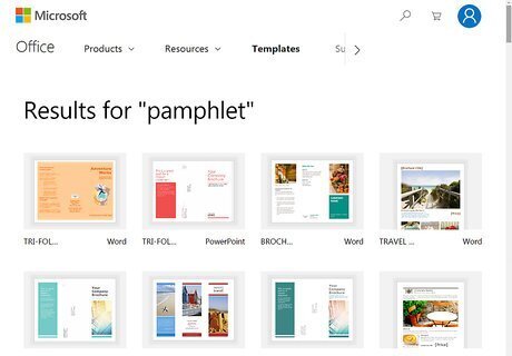
Use a pamphlet design program to create your pamphlet. Programs with a pamphlet template will help you make yours quickly and easily. Choose one of the following popular programs with a pamphlet template or find another online: Microsoft Word Google Docs Adobe InDesign LucidPress

Use images that will provoke an emotional response in the reader. Try to avoid images that are dull or generic, like clip art. Instead, choose images that are relevant to the purpose of your pamphlet and will encourage your audience to take action in some way. If your pamphlet is selling a product, for example, you could include a picture of someone using the product or the different varieties that the product comes in. Make sure you have the proper license to use any images you put on the pamphlet. Keep a consistent style of imagery throughout the pamphlet. Avoid, for example, switching between drawings and photography.

Include your logo on both sides of the pamphlet. Because you don't know which side of the pamphlet a reader will see first, adding your business's or organization's logo to both sides will help them understand what the pamphlet is for quickly. Make sure your logo is clear and visible so that, if readers are interested, they can research more about your organization online.

Make a sketch of your pamphlet before designing it online. Most pamphlets have 6 sides, each of which can be dedicated to displaying different information. Plan out what information and images you want to put on each side of the pamphlet before making it online. You don't have to be an excellent artist to sketch out your pamphlet. If you can't sketch a certain image or design, write what you want to include in that area instead. Show your pamphlet draft to other people involved in your business or organization before creating it online.
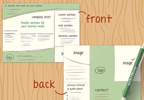
Design a front and back cover for the pamphlet. The front and back panels should be where you design your cover. Include your title, a few eye-catching images, your company or organization's name, and any social media page names you have on the back. Try to keep any specific details brief in this area, as you will add more information in the inside panels.
Formatting a Pamphlet
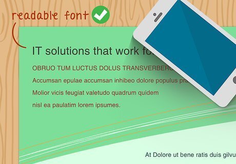
Pick a readable font. People will be more likely to absorb the information on your pamphlet if it is easy to read. Avoid using complicated fonts, hard-to-read colors, or overly small print that might make others strain to read the pamphlet. Basic fonts, like Times New Roman or Arial, tend to work best.
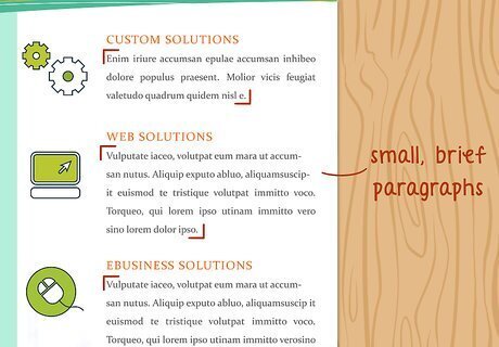
Keep the content skimmable. Pamphlets are designed to be read in a short amount of time and usually skimmed. Make your paragraphs small, no larger than 4-5 brief sentences. Read your information aloud a few times to catch any overly-complex or confusing phrases.
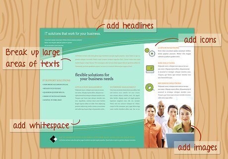
Break up any large areas of texts with images, headlines, or white space. To keep readers from losing interest, insert a headline or image whenever your paragraphs are too long (more than 4-5 sentences) or you have several paragraphs together without an image. If you can't think of anything else to add, add white space to separate the information into easily-digestible chunks.
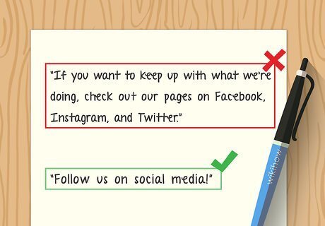
Use simple language while writing your pamphlet. You have a limited space to make your point on a pamphlet. Write your statements as clear and literal as possible to help your audience understand the information. Avoid flowery language or cliches, which both take up space and distract from the overall point. Avoid using jargon, which can confuse your target audience if they are less familiar with the topic. Instead of saying "If you want to keep up with what we're doing, check out our pages on Facebook, Instagram, and Twitter," for example, you could say, "Follow us on social media!"

Use bullet points to highlight information. Rather than blocking information out into long paragraphs, organize any paragraph larger than 5-6 sentences into bullet points with the key ideas. These will draw the reader's eyes to the most important information and help them read through the pamphlet quickly.
Printing Pamphlets
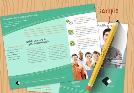
Make a sample copy first. Before you print all of your copies, test out the size and design by printing a single copy. If, after printing and folding the copy, you like how the pamphlet looks, go ahead and print out the rest of your copies. If not, continue tweaking the design and printing out samples until you're satisfied with the design. The type of paper you use for your sample copy does not matter, as the main purpose of a sample copy is to

Print your pamphlet with a printer that supports two-sided (duplex) printing. This will ensure that your pamphlet is printed in the right format so it can be easily folded. If you are printing pamphlets in bulk, contact a local print center—they may be able to print large quantities at a cheaper price than printing them at home. You may want to print your pamphlet in a more durable paper like cardstock to prevent them from tearing or crumpling.

Fold your pamphlet. Your pamphlet should be separated into 3 columns separated by 2 gaps on the page. Fold the right and left columns towards the center, then flatten and crease the side edges. Position the fold so that the side you intended to be the cover rests on top. These instructions are for the standard tri-fold pamphlet style. If your pamphlet template deviates from the six-panel, tri-fold style, you may find folding instructions on YouTube.

Distribute your pamphlet to places where it will be best received. After you've made a pamphlet, don't just let it sit around. Make a list of spots where your target audience will be most likely to pick up the pamphlet. Ask each place if you would be allowed to distribute pamphlets there, and drop off a stack of pamphlets to all willing places. Instead of "Don't forget to check us out on social media to keep up on what we're doing," for example, say "Follow us on Twitter, Facebook, and Instagram!" If you are making a pamphlet on the benefits of cognitive-behavioral therapy, for example, you might contact nearby community health centers, support groups, or counseling offices.


Comments
0 comment