
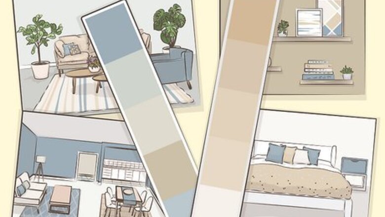
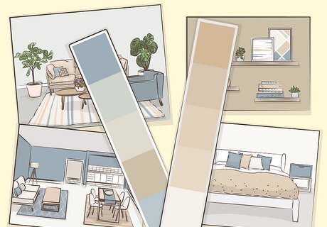
- Use the existing furniture and fixtures in your room as inspiration for your color scheme.
- Choose colors that match the function of each room. Energetic hues are great for social spaces while soothing colors are best for private spaces.
- Pick an exterior paint that complements your home’s features and goes well with the landscaping.
- Test out different paints at home before making any final selections.
Stick to colors that are appealing to you.
Focusing on your favorite hues helps narrow down the selection pool. Don’t worry about specific color combos and recommendations yet—just pick out your favorites for now. Not sure what you like? Take all of the color palettes and designs that appeal to you and place them side by side. Then, find the color (or colors) that are common among them all. Pick designs from calendar pages, magazines, catalogs, panoramic photos, postcards, and fabric swatches—these all have great, aesthetic layouts to choose from. Try narrowing down your options and choosing 3-4 colors that really speak to you.
Use a color wheel to choose hues that go well together.

The color wheel helps you visualize how different hues interact together. Better yet, it can provide you with inspiration for some fantastic paint colors that you can use around your home. Here are a few classic color schemes you can apply to your own design strategy with the help of a color wheel: Complementary colors: Colors that are direct opposites from one another on the color wheel (red and green, yellow and purple, blue and orange) Adjacent colors: Colors that are neighbors on the color wheel (red and orange, orange and yellow, yellow and green, etc.) Monochromatic colors: Different shades and color values from the same color family (light red, bright red, dark red) Triadic colors: Three colors that are the same distance apart along the color wheel (red, yellow, and blue or orange, purple, and green)
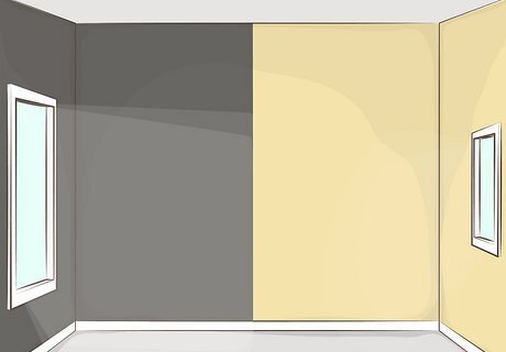
Choose a color scheme that complements what’s in your room.

Existing furniture and decor can serve as inspiration for your wall paint. Do you have an area rug, sofa, or another piece of decor that’s a prominent part of your living space? Take note of the major colors used in this item. Then, choose interior paint colors that are in a similar color family. If you have a big green sofa in your living room, you could narrow down your paint selection to green, blue, purple, and neutral tones. If your dining room has an orange area rug, you might stick with red, orange, and yellow colors for your paint.
Pick colors that highlight the function and energy of each room.

Warm colors are great for social spaces while cool colors are best for private ones. Warm colors include hues like red, orange, and yellow hues, which give off a cozy, conversational energy—they’re great for living rooms, family rooms, and other gathering spaces. Cool colors include hues like green, blue, and purple hues. They’re known for being soothing and calming, and are great for bedrooms and bathrooms. Here are some more specific vibes that each color gives off: Red: Stimulating and passionate Orange: Energetic and conversational Yellow: Happy and stimulating Green: Calming and serene Blue: Peaceful and reflective Purple: Relaxing and mystical Pink: Nurturing and tender White: Purity and creativity Brown: Stability and dependability Black: Elegance and mystery
Play it safe with neutral colors.
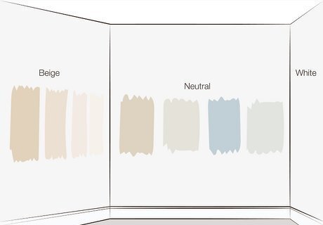
Beiges, whites, and other neutral tones never fail to look sharp. As an added bonus, neutral tones pair really well with a crisp white trim and ceiling. Check out color samples for different tans, beiges, browns, and creams and see what sticks out to you. Light neutral colors add a lot of brightness to a space, and are a great way to make small rooms seem bigger.
Opt for warm colors in well-lit rooms and cool colors in darker rooms.
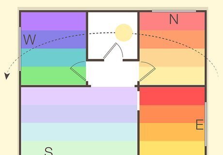
A room’s physical position in your home affects how much light it gets. North-facing rooms don’t get a ton of direct light, making them the perfect candidate for warm, cozy colors. South-facing rooms, however, soak in a lot of rays during the day and mesh well with cool, gentle colors. East-facing rooms tend to be brightest in the morning. Warmer, more energetic hues might be the best call if you’ll only be hanging out there in the evening. West-facing rooms tend to be brighter in the evening—if you need to head to bed early, you might benefit from cooler paint tones. Not sure which direction each room is facing? Download a compass app on your phone to check.
Brighten up your space with light-tinted paint.
Light colors make a room energized while dark colors make a space cozier. Does your living room not get a ton of sunlight? Brighten things up with a light and energetic color, like a yellow-tinted beige. Does your space already get a ton of natural light? Pick a dark, more saturated paint color to amp up the cozy vibes instead. A dark, saturated teal could be a great option for a warm, well-lit kitchen. A light, yellow-white could add a lot of brightness and warmth to a naturally dark office space.
Paint an accent wall a bold color so it stands out.
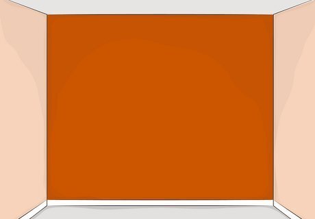
Accent walls let you add fun, bold hues into your home’s color scheme. Accent walls are just what they sound like—a single wall that’s painted in a bold “accent” color that draws your attention to a certain part of the room. For a more subtle look, keep your wall part of a monochromatic color scheme. If you’re feeling bold, pick an accent color that contrasts with the other walls. You might choose a burnt orange paint color to accent a room with peach-colored walls. You could choose a deep purple hue to contrast a room with off-white or neutral-toned walls.
Contrast your walls and fixtures to create a dynamic space.

Pick paint hues that are lighter or darker than the other items in your room. Let’s say you have a lot of white-colored chairs in your dining room—a light, cream-colored paint wouldn’t help these items stand out, while a charcoal gray or sage green hue would. Similarly, a light-colored wall helps emphasize bold-colored cabinets or other pieces of furniture. If you have an off-white sofa in your living room, you might play around with a bold purple or blue wall to add some contrast. If the desk in your study is a deep, rich brown, you might balance it out with a lighter, neutral-toned paint color.
Select exterior paint that complements your home’s natural features.

Inspect the colors in your home’s roof and other non-paintable features. Maybe your shingles have a blue tint or your brickwork has flecks of orange in it—choosing paint colors that complement these aspects of your home’s exterior can really tie your color scheme together. A home with neutral-toned, gray shingles might look good in a light green paint color. A brick house with dark shingles and dark brick flecks could look good with white trim and dark blue shutters. It’s hard to go wrong with neutral-toned paints, but feel free to play around with different colors and see what looks best for your home. Take a look at the exterior color scheme of your neighbors’ homes before settling on one for your own house. You don’t want to end up clashing with the rest of the neighborhood!
Show off your home’s exterior with accent colors.

Paint over the architectural highlights of your home with accent paint. Maybe your home has a lovely front porch railing or beautiful trim that dips down below the roof. Show it off with a brighter, bolder accent color—just make sure that you aren’t highlighting any of your home’s less attractive features in the process. Save the accent paint for your shutters and trim, not your air conditioner and gutters. A home with a beige base color could look beautiful with teal- or coral-colored accents, while a blue-painted home would look amazing with white accents.
Opt for an exterior paint color that blends with your yard’s landscaping.

The size and color of your landscaping play into your home’s visual appeal. Factor in how many trees, shrubs, bushes, and flowers you have growing in your yard, as well along with the colors of each plant. Pick a paint color that complements your yardwork without blending in too much—for instance, an earthy green paint might not look as sharp if your yard was filled with trees and shrubs. Play it safe if you don’t have a lot of plants in your yard—in this case, a neutral-toned paint might be the best call. Don’t be afraid to think outside the box with your color scheme! Sunny yellows, gentle greens, and rustic reds all have the potential to be beautiful.
Consult color selection tools if you’re low on inspiration.
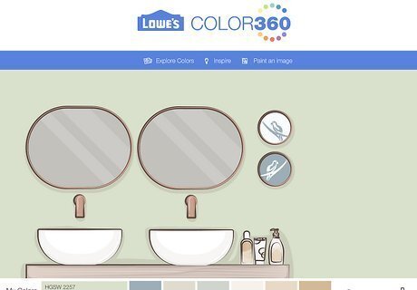
Digital apps make it easy to picture different paint colors in your home. Paint color apps let you test out different shades of paint in a sample photo of a room. Some even create customized color palettes to help build your vision. Here are just a few to check out: Glidden (iOS and Android) Lowe’s Paint Visualizer Project Color (iOS and Android) ColorSnap Visualizer (Computer, iOS, and Android)
Choose a flat or glossy finish that best shows off your paint.
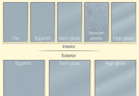
Flatter sheens hide flaws, while glossy sheens are attention-grabbing. Interior house paints come in 5 common styles: flat, eggshell, semi-gloss, Venetian plaster, and high-gloss. Eggshell and semi-gloss are the easiest to care for, while Venetian plaster and high-gloss offer the most dramatic finishes. Think about your biggest priorities as a homeowner and narrow down your decision from there. If you’re renovating an older home, you might choose a flat finish paint to hide some of the wear and tear on the walls. If you have kids at home, you might opt for a semi-gloss or eggshell paint that’s easy to wipe down. If you’re focused on aesthetics, high-gloss or Venetian plaster might be the best options for you. Exterior house paints come in 3 main finishes: satin/eggshell, semigloss, and high gloss. High gloss paint is shiny and good for accents, semigloss is great for windowsills and trim, while satin/eggshell works well as a base color.
Test out the paint at home.

See how the paint looks in your home before committing to anything. Stop by your local paint or hardware store and pick up small, sample-sized containers of your paint color candidates. Then, apply the paint to heavy-duty sheets of paper and set them around your home. Examine the paint samples throughout the day and see how they look at different times and in different light settings. To test exterior paint, apply the paint to different sample boards and set them around the outside of your home. Take a peek at the boards when it’s both sunny and cloudy, so you can get a feel for how the paint looks overall. Some paint stores might offer stick-and-peel paint samples of different paint colors, which are super easy to apply and test out.


Comments
0 comment