views
X
Research source
Before making the graphic, you'll need to gather data, including statistics if applicable. You can use any number of online sites and resources to create your infographic and give it a polished, professional look.
Researching a Message and Data

Choose a topic or message for your infographic. Your infographic needs to convey information that educates its readers about a topic or persuades readers to agree with a message. For example, perhaps you want to impress upon a high school gym class the benefits of exercising regularly. Using an infographic to show them statistics regarding teenage obesity and weight loss is an effective way to convey the importance of regular exercise. Infographics can use both graphics and statistics to illustrate the message you'd like to communicate. Infographics can have many uses outside of generating business revenue. Non-profits, universities, and individuals can benefit from infographics, in addition to companies.
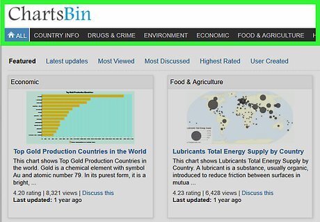
Gather data that supports the topic of your graphic. Without suitable data, your infographic will only show 1 person’s opinion. Fortunately, you can find reliable data from online sources. For example, for an infographic about the benefits of high-school exercise, you could find data about teenage obesity and ways it can be decreased. The following are good places to find statistics: Use Google’s public data crawler at: https://www.google.com/publicdata/directory. Visit Chartsbin.com. You can access tables and charts filled with statistics from around the world, such as hunger, marriage, crime and disease numbers. Try StatPlanet for more worldwide statistics. Go to government agencies, such as the US Bureau of Labor Statistics or the EPA to get reliable civic statistics. Read trade journals and scientific studies to get other types of study-based data.

Make a flow chart of how you would like to visually present your data. Because the infographic will be primarily visual, think of a way that you can structure the data so one point leads logically to another. For example, you could open with a statistic about teen sedentary lifestyles. Below that, present 3 or 4 possible solutions (e.g., joining a sports team, cycling, and community fitness programs hiking), with their respective success rates at lowering teen obesity. You will have a better idea of the template or style that will work best if you sketch out several images, statistics, and headings in on a piece of paper. You can draw a crude sketch at this point, since it doesn't need to be anything fancy. Keep brainstorming new flow charts until you find one that looks effective.
Choosing Tools to Build Your Infographic

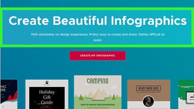
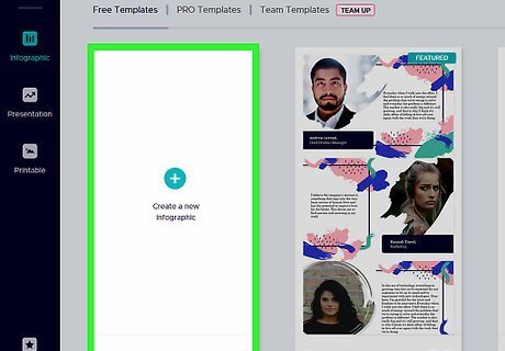
Choose a template-based infographic site to design your graphic. Free and subscription-based websites allow you to create visual tools that can be downloaded or embedded in your infographic. If you'd like to use an easy online infographic tool, check out Easel.ly. It allows drag-and-drop based graphic layout, meaning that you won't need to know any coding or programming to use it. You can also use Venn Gage for another free, user-friendly site to make your infographic. See more at: https://venngage.com/. Piktochart.com is available for $29 per month.

Opt for a service like Timeline JS or Dipity if you're creating a timeline infographic. These sites help you create an infographic based on a chronological timeline of events. Upload your photos to use as illustrations. A timeline layout is ideal if you’re trying to show the way a certain trend developed over a period of time. For example, if the main purpose of your infographic is to show the increasingly sedentary lifestyles of teens over the 20th century, a timeline layout would be most effective.
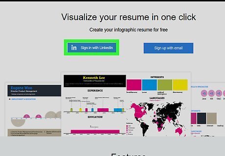
Use Visualize.me to create an infographic that doubles as a resume. If you're planning to use information from LinkedIn account to make a personal infographic, Visualize.me will provide you with the capability to do so. This will give you a fun, visually appealing way to present your professional qualifications. This is useful for infographics on which you’re advertising a specific service you provide (e.g., pet sitting or personal training). Find out more online at: http://vizualize.me/.
Laying Out the Text, Images, and Graphics
Give your project a vertical layout. Most websites and mobile devices process vertical images better than horizontal. If you create a horizontal infographic, mobile users will struggle to read the image. Consequently, only a relatively small audience will be able to read your infographic.
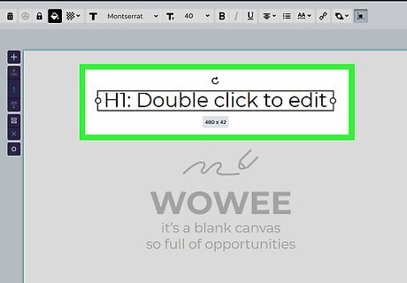
Place a large headline at the top of the graphic. Use a big font that is easy to read, so that it catches the reader’s eye. If you're planning to present numeric data or statistics, use a number in your headline. For example, write “Ways to Decrease Childhood Obesity,” “How Much Time Do People Spend Online Every Day?” or “12 Countries with Advancing Technologies.” When writing the title, select a font that's easy to read and conveys the personality of your infographic. If your office has graphic design personnel, consult with a typographer or a graphic designer if you are unsure which font will work best.
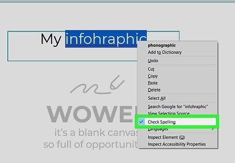
Proofread and edit your text to remove any errors or typos. Since infographics use different layouts and have several different text boxes, it can be harder to spot mistakes than it would be on, say, a press release. So, take the time to edit your own work: read the text to yourself and correct any grammatical or content-level errors. If you're working in an office environment, ask 1 or 2 coworkers if they'd be willing to review your writing as well.
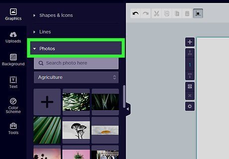
Accompany your statistics with 1–6 images to draw viewers in. People are drawn to visuals, so draw the conclusions of your infographic in graphics, rather than text. Using custom illustrations can increase the popularity of your infographic. Viewers should respond well to the graphics when they realize the illustrations are custom-made. For example, your pie chart regarding teen exercise rates and their effectiveness could be in the shape of a basketball. Or, have an artistic friend draw 1-2 images of happy, jogging teens to pair with your statistics on teen health. If you’re creating the infographic to advertise an Instagram account or photography business, choose photos instead of illustrations. If you don’t have the resources to create your own illustrations, you can find plenty of free images online. Many of the free infographic-design websites will also offer free generic images.
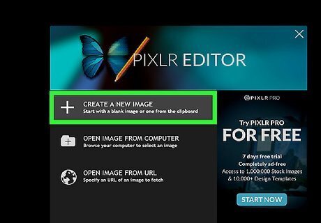
Assemble the final product. Once you have all of the different elements of the infographic ready—data, graphics, images, text—you’re ready to put the final graphic itself together. You can do this in various computer programs like Photoshop, InDesign, or Gimp. If you’d prefer a free, online approach, use the Pixlr Editor. Find out more about the Pixlr photo site at: https://pixlr.com/editor/.




Comments
0 comment